Portfolio ✦ 2026

Share a brief

← All work

Nomad Drinks

Nomad

Fruit, in full volume.

Client

Nomad Drinks

Role

Brand identity, campaign art direction, packaging

Timeline

2026

Team

me + two devs

Status

Launched

Nomad store board

The mess

A visual identity with appetite

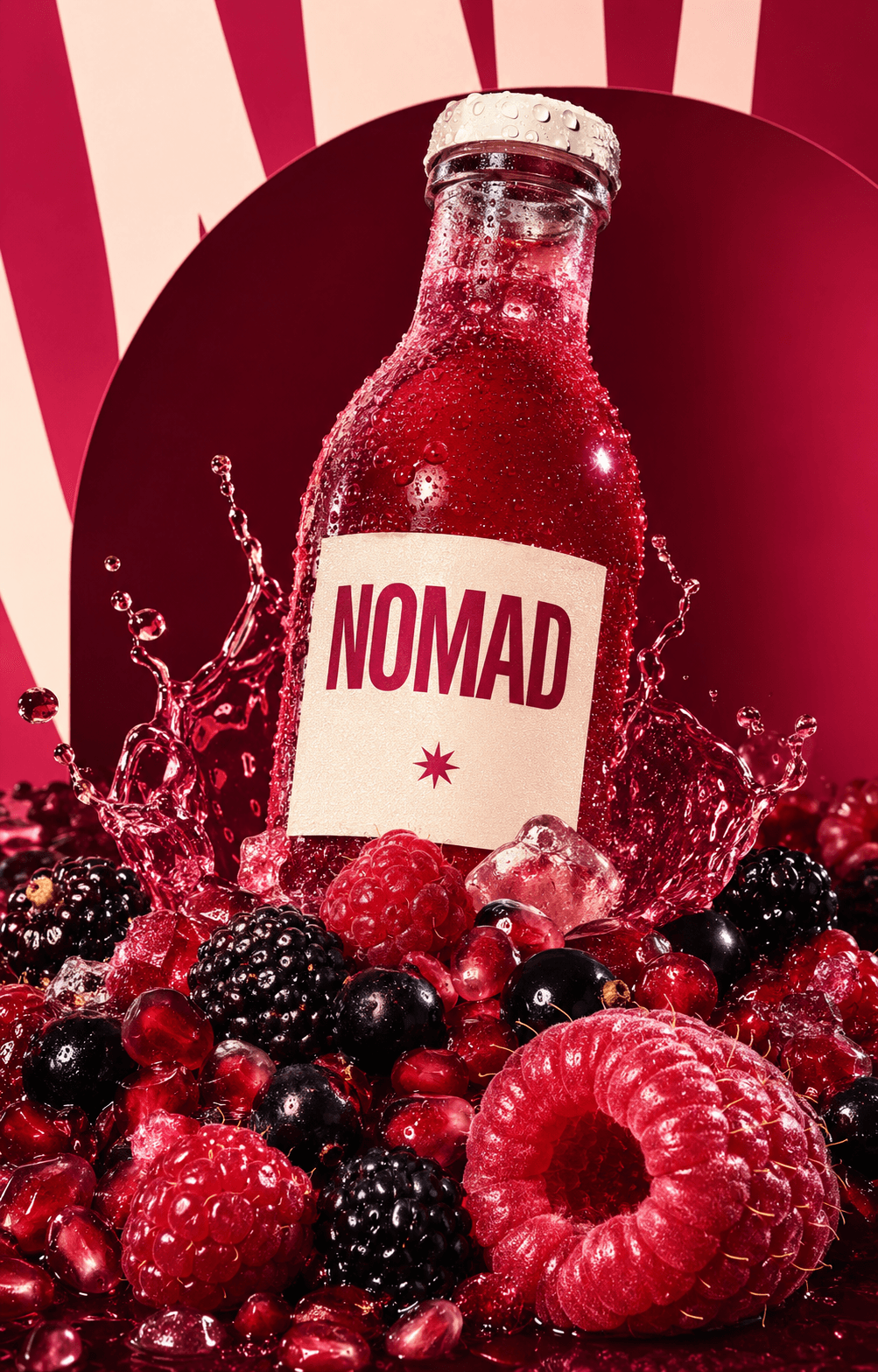
A condensed wordmark, sharp star symbol and saturated raspberry-to-plum palette gave the brand a distinct visual signal.

The marker work

Packaging that behaves like advertising

The bottle label was designed like a poster: direct, oversized and instantly recognisable from a distance.

The payoff

A digital store built as a campaign

The website lets the product world lead: big fruit, bold type and a fast path from first look to checkout.

04

Campaign workstreams

05

Scope areas

07

Launch touchpoints

the launch, end to end

The brief was not to make another quiet wellness drink. It was to create a launch with enough visual charge to own a fridge door, a browser window and a wall across the street.

Nomad Drinks

·

the brief

The launch, in the wild.

Built to be seen.

Built to be seen.

the store, before the rebuild

master visual: fruit, fizz and three bottles turned into the central campaign image.

golden hour campaign shoot

digital shop: a product-first store that feels like entering the campaign, not browsing a catalogue.

packshots from the field

street billboard: a single large-format poster built to stop people on the way home.

built to stop people on the way home

the flagship shelf, reset

flavour world: close-up fruit photography, tactile, cold and impossible to ignore.

hills that sold the jackets

print system: layered type, wet ink and berry photography as physical campaign material.

mobile checkout, one tap

retail activation: a branded fridge that turns the product display into advertising.

the store, before the rebuild

master visual: fruit, fizz and three bottles turned into the central campaign image.

packshots from the field

street billboard: a single large-format poster built to stop people on the way home.

built to stop people on the way home

hills that sold the jackets

print system: layered type, wet ink and berry photography as physical campaign material.

golden hour campaign shoot

digital shop: a product-first store that feels like entering the campaign, not browsing a catalogue.

the flagship shelf, reset

flavour world: close-up fruit photography, tactile, cold and impossible to ignore.

mobile checkout, one tap

retail activation: a branded fridge that turns the product display into advertising.

the store, before the rebuild

master visual: fruit, fizz and three bottles turned into the central campaign image.

hills that sold the jackets

print system: layered type, wet ink and berry photography as physical campaign material.

the flagship shelf, reset

flavour world: close-up fruit photography, tactile, cold and impossible to ignore.

packshots from the field

street billboard: a single large-format poster built to stop people on the way home.

built to stop people on the way home

golden hour campaign shoot

digital shop: a product-first store that feels like entering the campaign, not browsing a catalogue.

mobile checkout, one tap

retail activation: a branded fridge that turns the product display into advertising.

got a messy idea?
perfect. bring it.

heymira@design.com

© 2026 Mira Kim ✦ Designed with curiosity

Create a free website with Framer, the website builder loved by startups, designers and agencies.